We use cookies to enhance your browsing experience and measure content performance. See our Privacy Policy.

Brightlane — Brand Guidelines (AU)
Visual identity, logo rules, colour palette, typography and imagery guidance tailored for content creation across Australia.
Purpose & usage
This guide ensures consistent presentation of Brightlane across owned channels, partner platforms, and paid media in Australia. Use these rules for content production, templates, and third‑party briefs.
- Primary applications: social, video overlays, blog headers, campaign landing pages
- Do not alter logo proportions, color roles, or safe area rules
- Accessibility: maintain 4.5:1 contrast for text on brand colours where possible
Logo & clearspace
Primary mark
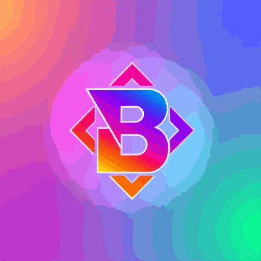
Use the full mark on light or neutral backgrounds. Maintain clearspace equal to the height of the 'B' from the mark.
Incorrect usage
- Do not rotate, stretch, or change brand colours.
- Do not place on busy imagery without an overlay.
- Avoid low-resolution export for animated overlays.
Colour palette
Midnight
#0B0F1A
#0B0F1A
Violet
#7A00FF
#7A00FF
Cyan
#00FFFF
#00FFFF
Sky Tint
#8FE3FF
#8FE3FF
Usage guidelines
Primary brand colours: Midnight, Violet, Cyan. Use Violet for CTAs, Cyan for accents and motion, Midnight for backgrounds and large type.
| Primary | |
| Accent | |
| Neutral |
Typography
Primary type
Inter — use for UI, headings, navigation. Weights: 400, 600, 700.
Aa Bb Cc Dd
Heading example — content marketing that converts
Web fallback
System stack: Inter, -apple-system, BlinkMacSystemFont, "Segoe UI", Roboto, "Helvetica Neue", Arial.
Use sufficient letter spacing for large uppercase titles and maintain readable line length for article copy (50–75 characters).
Imagery & photography

Brand face

Ava Morgan — Creative Director
Style notes
Prefer candid, high-contrast portraits and environmental shots that show work-in-progress, studio setups, or on-location social shoots. Crop dynamically for short-form thumbnails — centre on faces and key action.
Templates & social formats
Video overlays
Use Violet for lower third bars, Cyan for subtle animated accents. Keep text within safe margins and use semi-opaque gradients when placing on footage.
Post formats
- Instagram: square 1080x1080 — focus on centre cropping
- Reels/TikTok: vertical 9:16 — headline top, logo bottom-left
- Blog headers: 1200x675 — wider composition, text left-/right-aligned
FAQ
External partners may use assets under a license. Contact Brightlane via Contacts to request approved files and terms.
High-resolution vector and PNG assets are available on request. Use the "Request source assets" CTA to initiate.
Follow WCAG AA contrast guidelines. For Australia-specific campaigns, ensure content meets local advertising and privacy standards.